Bike Shop
Overview
LeaLea company sells bikes on their mobile-web experience.
In Hawaiian, LeaLea means "happiness" and "joy".
Brand personality — an expert in the field who is always knowledgeable about the very latest trends and best products related to biking.
Problem
The company's management has shared data that shows 50% of users open on average seven page views and then abandon the site without moving anything into the cart. The stakeholders hypothesis is that users are unable to determine which bike is best based on relative features.
In addition, 70% of users who place an item in the cart do not buy. The data show users abandon the cart on the registration page. Right now, users must make an account to purchase.
To greatly improve their product's usability, they need to enhance their browsing and checkout experience. Improve conversion from browsing to completion of checkout to increase revenue on the product's mobile web experience.
My Role
LeaLea has brought me on board to run a secondary research, sketching explorations, wireframes creation, user flow analyses, and creating high fidelity prototypes to be implemented.
Solution
To find possible solutions to the problems, I decided to research the existing bicycle market and why customers usually do not complete their orders. For this purpose, I decided to use secondary online research.
The audience, who struggles with buying bikes:
The research confirms the company's assumption of the target users, which are:
- 24 - 38 years old
- User base is 72% men
- High income earners
- They take biking very seriously
- They will spend a lot of money on this investment so are very picky and do their research
Main factors impacting Checkout Abandonment
The Baymard Institute study on the reasons for abandonments during checkout took data from 41 separate studies and concluded that most checkout abandonments are due to excessive additional costs, and are ranked second and third, the need to create an account, and the checkout process is unnecessarily complicated.

Why offer guest checkout?
It can reduce abandonment rates. It sends shoppers directly to payment forms. Checkout seems like less work with it. You can still provide a registration option at the end of the checkout process.
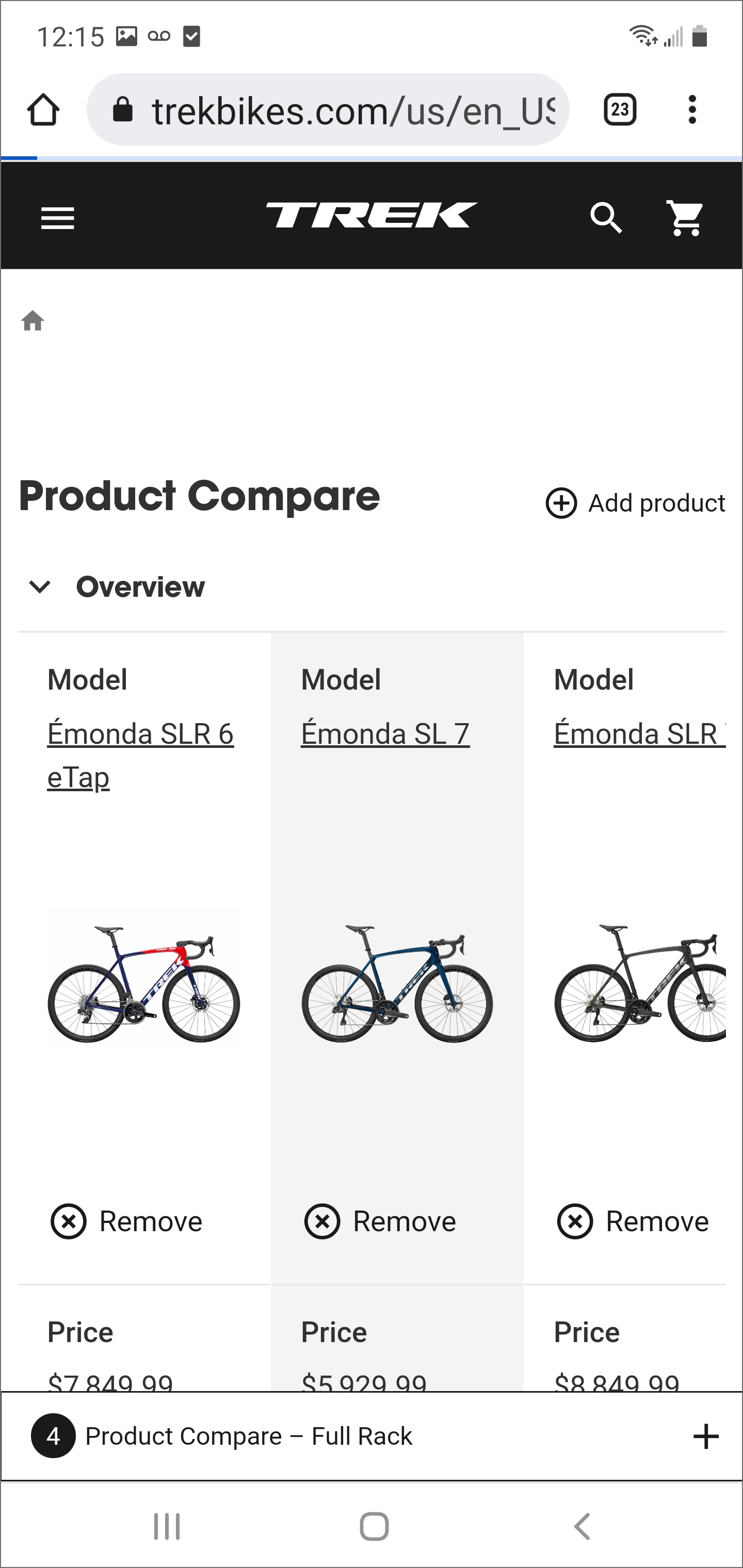
According to the company, 50% of users leave the site without adding any items to their shopping cart. The reason for this is that users cannot determine which bike is better based on relative features.
The following solutions can be proposed as a solution to these problems:
Comparison Tool
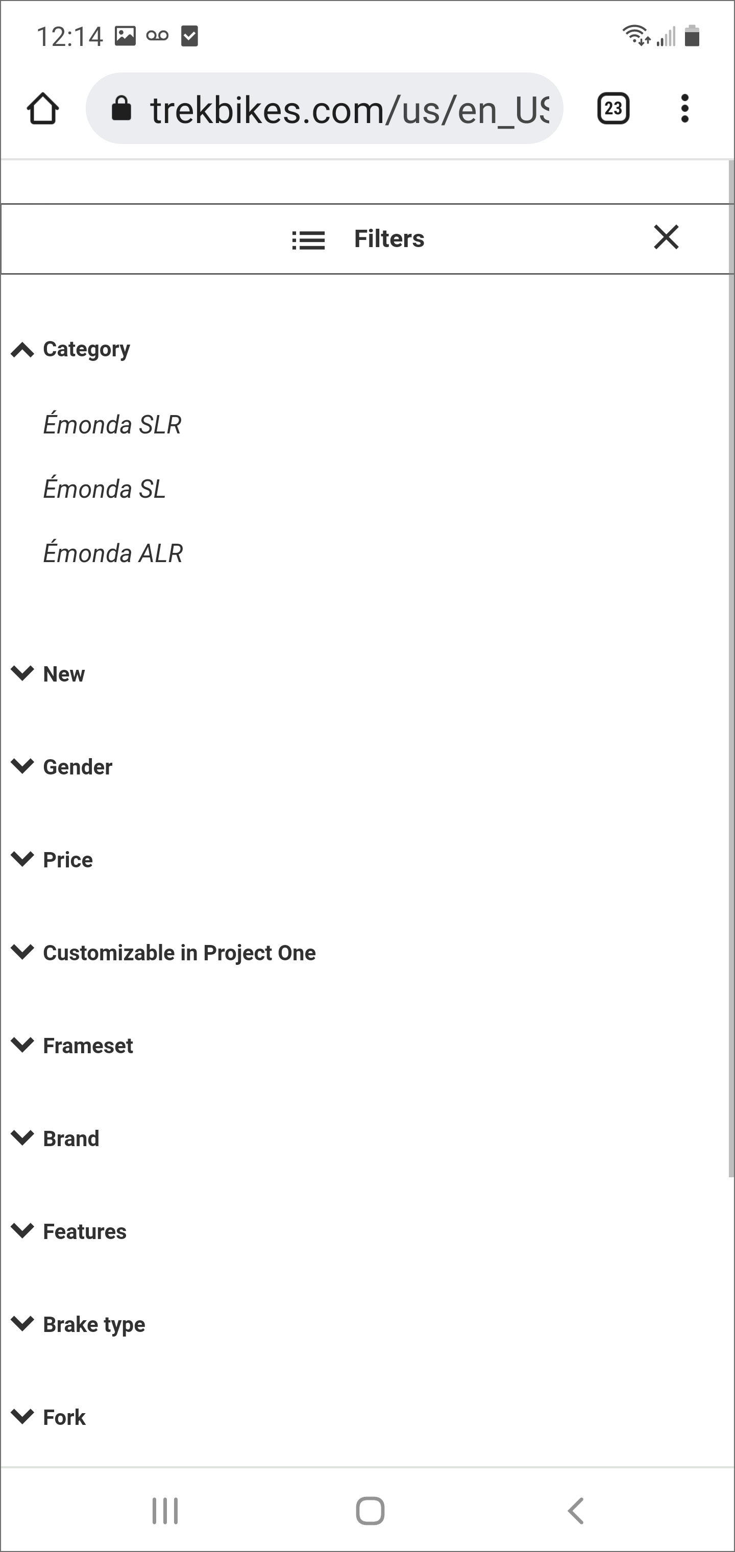
Search Filter
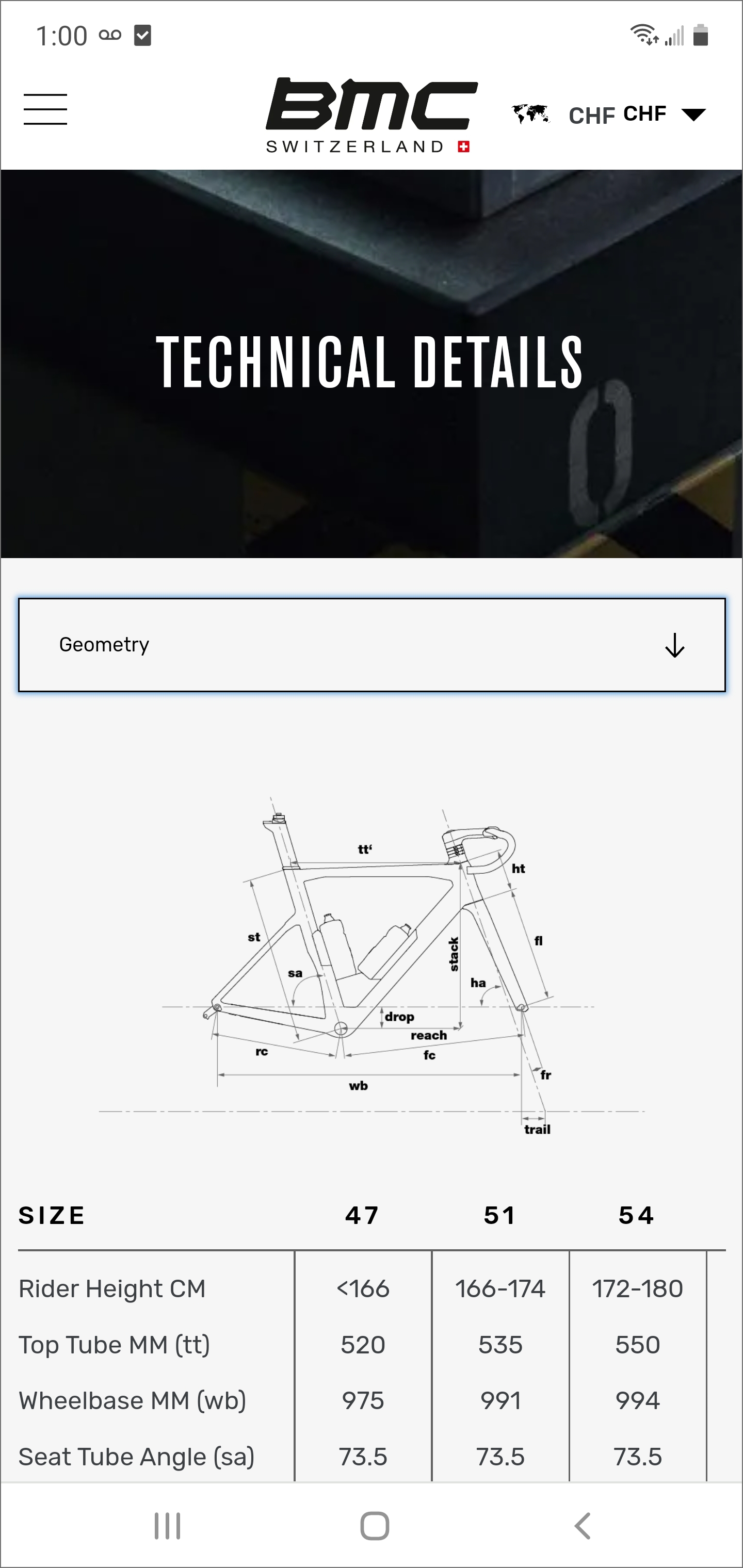
Detailed Tech Description
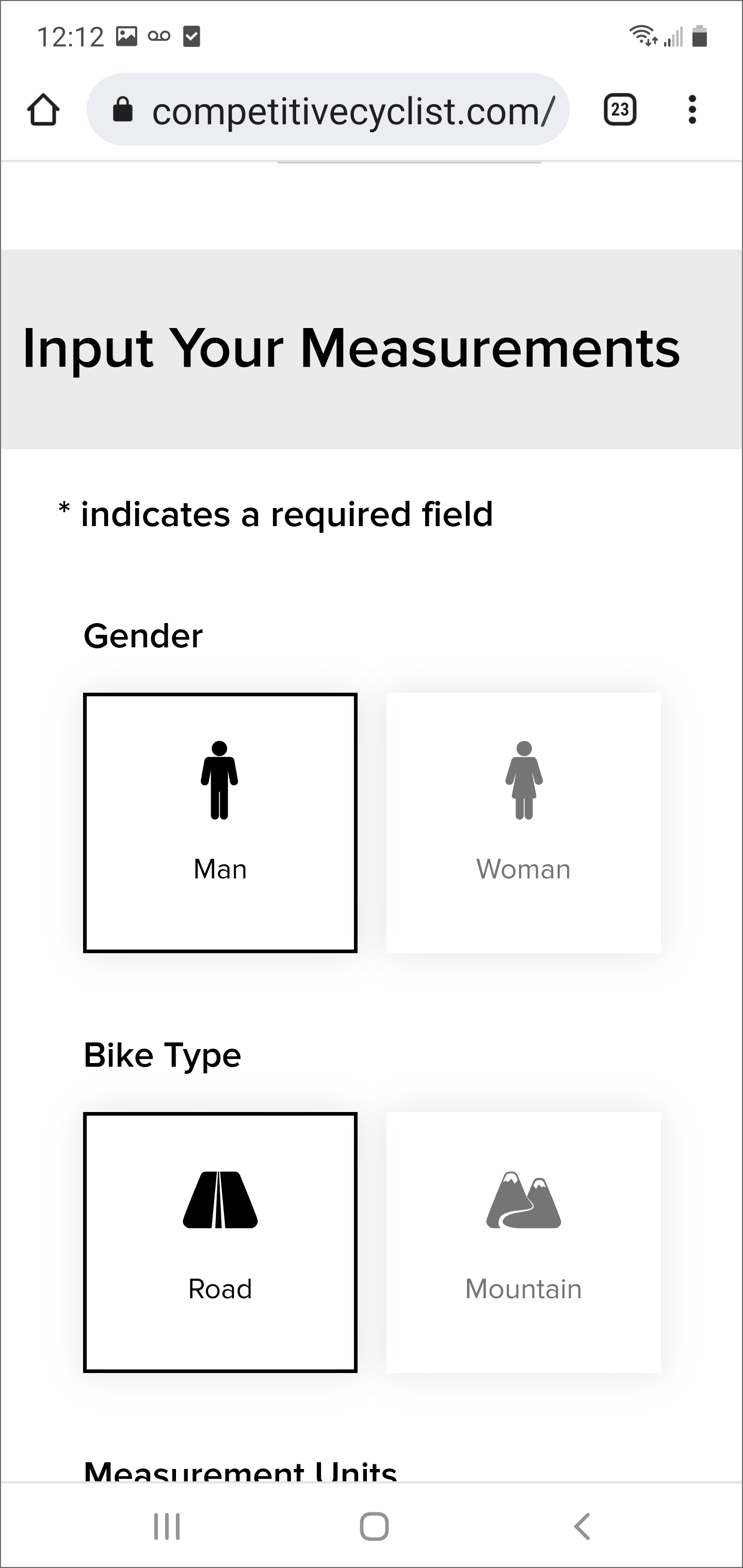
Fit Tool
And finally, nothing is really more important for creating a great cycling experience than matching yourself, your body, your goals, and your dreams to the right bike.
Conclusion
Based on the above research, the listed changes could significantly improve LeaLea's products usability, enhance their browsing and checkout experience, improve conversion from browsing to completion of checkout, and increase revenue on the product's mobile web experience.
I framed the problem statement as “How might we…” questions:
- How might we build a solution to compare different bike models for bike buyers?
- How might we provide a solution that allows bike buyers to purchase bikes as guests?
- How might we provide more detailed technical information about a specific bike?
- How might we build a solution that allows bike buyers to enter personalized parameters to the application and get suitable bike models as a result of the app analysis?
Design and Ideate
The design stage of the UCD process is the stage in which I started making design decisions and visualizing a solution based on what I learned from my research during the Discovery stage. I begin to explore solutions to the problem I'm trying to solve and identify a solution that I’d like to prototype.
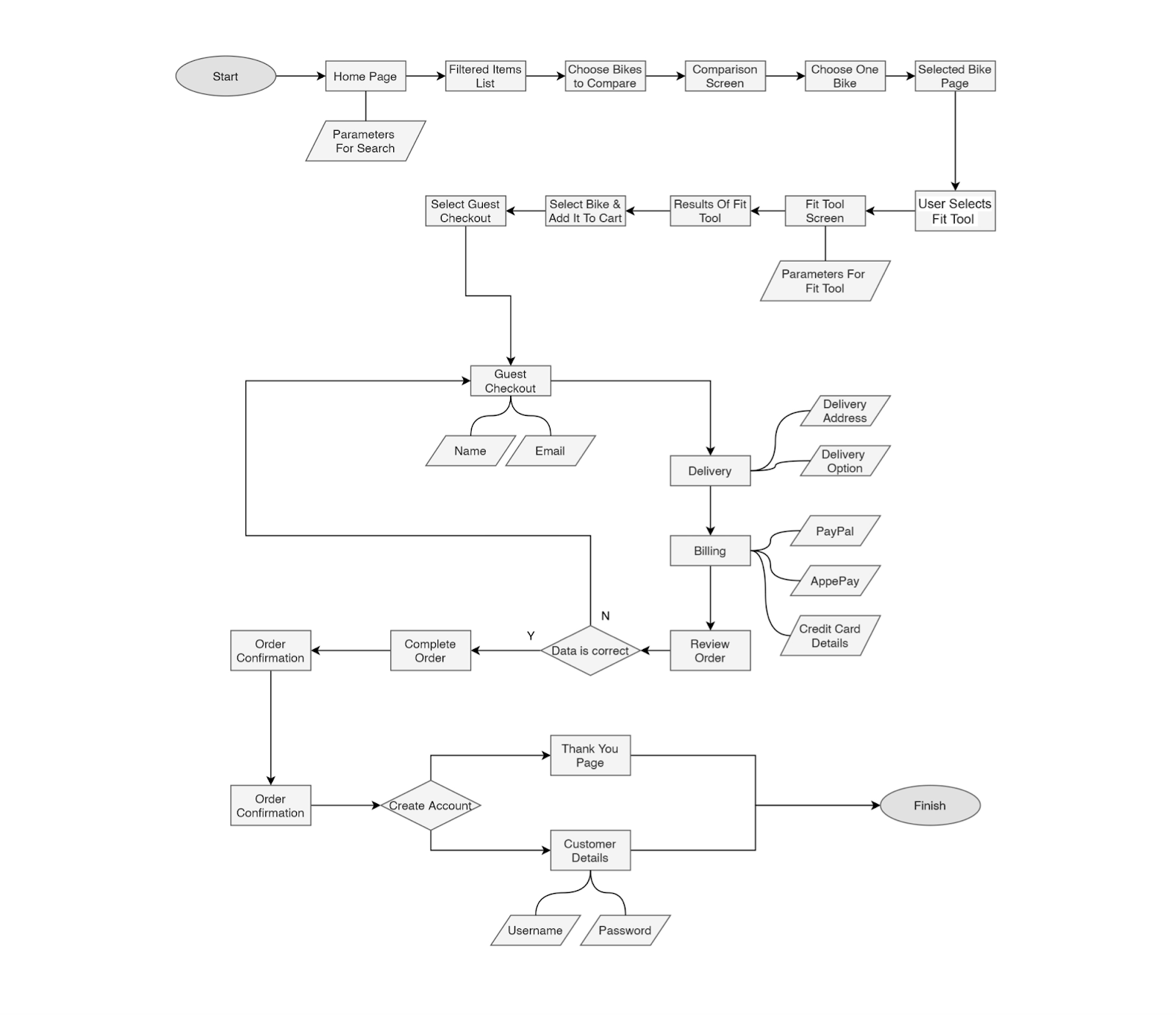
User Flow
The next step of my project is to create user flows that help me identify the critical paths users will follow when using the application.
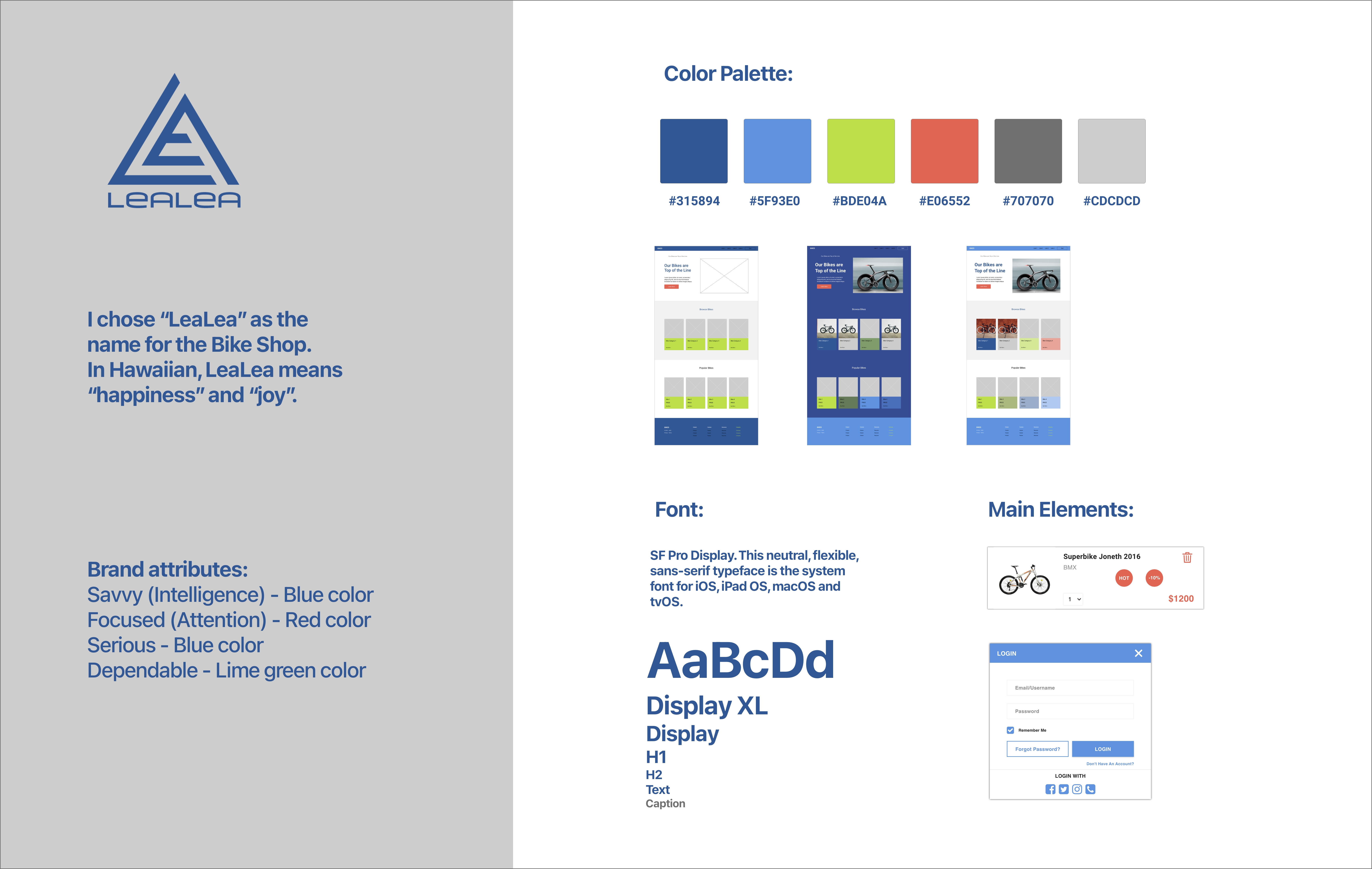
Building a Style Guide
I created a style guide for my project. A color palette sets the tone of a product, a site or an app and creates an emotional connection between that product and the user. Font directly affects the readability and ease of use of a product.
Ideating the first concepts
I started to create hand-drawn sketches after all the supporting data was presented.


Once there was no issue with the sketches, I moved on to creating wireframes. I used wireframes to define the hierarchy of the elements that make up my product, which will, in turn, help me determine the layout of my product. Wireframes lie firmly in the middle between sketching and high fidelity mockups; they’re more complex than sketches, but they still offer the flexibility and room for innovation that comes with sketching an idea.

Prototyping
Once the prototypes were created, I sent the links to users to get a feel of the actual app for quick user testing.


Note: Click here to view the prototype.
Product Demo
Bike Comparison Interaction
Guest Checkout Interaction
Technical Details and Fit Tool Interactions
Validation and feedback
I invited the same five participants from the user interview to conduct this test using moderated remote user testing. During the test, I asked users to think out loud about everything that crossed their minds. I recorded part of my test after getting the user's permit. This allows me to understand the users better during the entire process. All five users were able to complete the tasks. The only purpose of this test was to test the design of the application. User interactions have been reduced to the minimum, which is sufficient to complete the tasks.
During design and research, I identified the typical processes of eCommerce mobile applications, improved the usability of the product, and browsing and checkout experience.
I hope my enhancements boost conversion from browsing to completion of checkout to increase revenue on the product's mobile web experience.
